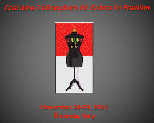
From November 20 to 23, Florence has been tinged with thousands of shades both old and new, due to the fourth edition of Costume Colloquium, the biennial symposium of fashion culture whose theme in 2014 was Colors in Fashion. Leading experts and scholars in the field gave rise to an intense debate on the importance of colors in fashion history and everyday life. Given the huge quantity and high quality of the contents of these four days, I divide my reportage of the event into more thematic coverage, starting with the significant relationship between and among fashion, art and colors.
Even if fashion is not yet culturally recognized as one of the 11 arts of the ancient and contemporary world, this Costume Colloquium IV has been an excellent opportunity to discuss the dichotomous relationship between these disciplines and how they influenced each other after the invention of new synthetic dyes in the late nineteenth century. It’s no surprise that one of the hot topics of the conference was about the color correspondences between the dresses presented in the black and white illustrations of women’s magazines and the garments made by the ateliers in the XIXth century.
Let’s begin with Susan Kay-Williams, chief executive of the Royal School of Needlework in London, and her paper titled “Shade Cards and Dye Sample Books 1856-1906: What Do They Tell Us About Colors in Fashion of the Period?” She pointed out how the color trend business developed in just 50 years. At first customers simply took patterns to their tailors choosing fabrics and colors that would suit their needs or the suggestions of the magazines; subsequently a sort of differentiation of color tastes spread all over the world, varying from country to country and causing even the disappearance of some colors from the palette. Thanks to the study of Charlotte Nicklas, Senior Lecturer from the University of Brighton, and her paper entitled “Cabbage Green, Tyrian Purple and Eugenie Blue: Color and Language in Mid-Nineteenth Century Women’s Fashion“, it was important to discover that the color trends could even depend on the sophisticated names that fashion writers attributed to the colors in women’s magazines. In addition to the most commonly used “cabbage green”, “lavender bloom” and “raven’s wings”, which revealed naturalistic references, readers matched black and white fashion illustrations with evocative names, always in French, such as “Terre d’Egypte”, “Fumée de Londres”, bloody battles like “Magenta”, “Marengo” and “Solferino”, or with famous personalities such as “Eugénie Blue” and “Haussman Red”. You could even find expressions like “Indescribable” because rendering a new color just by using words was a real challenge at that time!
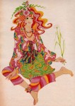
Next, Jennifer Rice, freelance archivist from New York, presenting the speech “Imagining Color: Fashion and the Hand-colored Postcard” argued that we can get an idea of the growing collective interest in colorful pictures thanks to the vast spread of hand-colored postcards. These little squares of paper had many themes and subjects such as women from far-off countries wearing traditional costumes, or the beautiful gowns worn by famous actresses. These pictures carried the imagination of the observer into a fairy-tale-but-true world, to which colorists enjoyed adding decorative patterns and jewelry just to emphasize the dreamlike atmosphere already given by the colors.
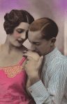
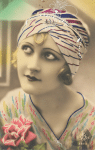
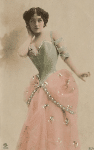

Hand-colored postcards – Note the patterns added by colorists
With the paper “Rough Wolves in the Sheepcote: the Meanings of Color Fashionable, 1909-1914” by Clare Rose (visit her blog http://clarerosehistory.com), Contextual Study Lecturer at The Royal School of Needlework, we entered the heart of the art/fashion universe because despite the intense shades such as “Royal Blue” and “Mandarin” suggested in 1904 by the fashion journal Les Modes, conventionally the introduction of bold colors in fashion history is attributed to one man, Paul Poiret. He replaced the old pastel colors with wholly new bright shades that he nicknamed “rough wolves”; it’s important to note that this big change in fashion taste is mainly due to the appearance on the international art scene of movements like the Fauves (1905), the Futurists (1909) and the Ballets Russes of Diaghilev (1909). As reported by Michelle Finamore, Curator of Fashion Arts at the Museum of Fine Arts in Boston, in her study “Color before Color: Tinting Fashion Reels in the Silent Era“, the same Paul Poiret knew well the importance of color, and in 1913 was one of the first designers to film a fashion show using Kinemacolor, a costly process for making colored films, that allowed him to present his Turkish collection to a large audience during the first trip to the US. So much of our world has come from this.
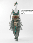
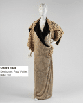
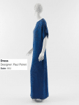
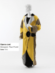
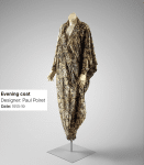
Paul Poiret dresses – MET Museum, Costume Institute collection, New York
In fact, the marriage between fashion and art with the consequent return of bright and bold colors re-occurred a few decades later in 1967, in what Lauren Whitley, Curator of Textiles and Fashion Arts at the Museum of Fine Arts in Boston, defines the “peak of psychedelic fashion” in her paper “Psychedelic to Camp: Color in Fashions 1967-1973“. In those days the London art scene was ruled by collective groups such as The Fool who created posters, albums, and clothes lines featured by the mix of kaleidoscopic patterns in yellow, orange, purple and green, reproducing the visions they had while using drugs. Psychedelic fashion was not only a women’s matter: in fact even The Beatles were huge fans of this whole new fashion language. For example, Granny Takes a Trip was the must-see London’s menswear store where jackets were made of “every color that could offend the parents“, and with special materials such as silk, satin or velvet, also giving a different “tactile experience“.
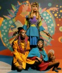
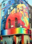
Illustrations, clothes and the huge murales of The Beatles’ Apple Boutique made by the collective The Fool
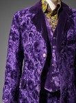
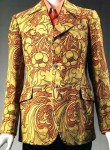
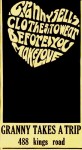
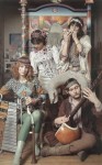
“Granny Takes a Trip” memorabilia and fashions
Continuing our time journey we arrived at the present days thanks to Giulia Tonucci, PHD Candidate of the University of Bologna. In her paper “The Color of Performing Wearable Technologies” she observes that since the advent of technology in fashion, colors are no longer a simple characteristic of the clothes, but a “performing feature” often associated with body movements or even sounds. Among the most curious examples shown in the presentation there was the famous Transformer dress of the autumn winter 2007 collection by Hussein Chalayan, a multi-layered dress studded with LED lights where special motion sensors shorten or lengthen the edges of the top layer to reveal the complicated underneath structure.
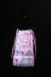
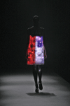
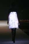
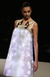
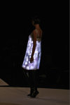
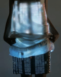
Hussein Chalayan – FW 2007 – Led dress
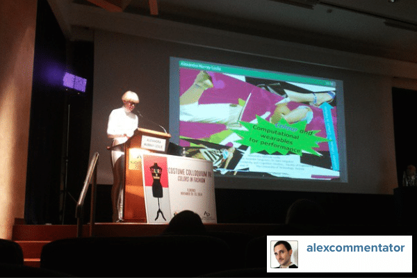
The Colloquium concluded this mixed “odi et amo” relationship among art, fashion and color with a jump into the future with “Color Tuning“, the APP that artist Alexandra Murray-Leslie presented for the first time in public exclusively at the Costume Colloquium IV with an art-performance. The digital application mainly developed for performing arts (even for fashion shows) works by pointing the digital viewfinder of the iPad on a dress. It identifies the color and the type of dress and through specific algorithms it turns them into a sound. Each movement of the viewfinder gives a different combination of colors, and consequently a different sound that “tunes in” the various objects or bodies, allowing the public and the artist himself to live a true synesthetic experience involving more senses and more simultaneity.
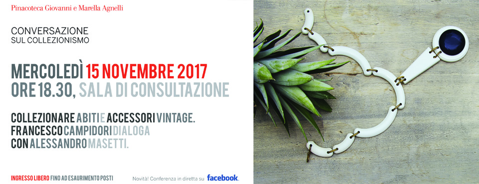
Alessandro Masetti – The Fashion Commentator